Yomp
Business-End Management Tool
Overview
Roles
UX Designer
Problem
Yomp needs a tool that can be used by outside groups to post events and deals, as well as by admins to manage the groups and any content they post. Due to the target audiences being both private businesses and campus affiliated groups, one of the main concerns was creating an architecture that accounted for the needs specific to each user type.
Key Insights
Design projects may not always allow for the ideal factors of a shared setting or in-person collaboration. Adapting to remote work requires designers to understand the limitations inherent in digital settings and discover creative solutions.
Timeline
August 2017 - February 2018
Design Process
User Workflow & Requirements
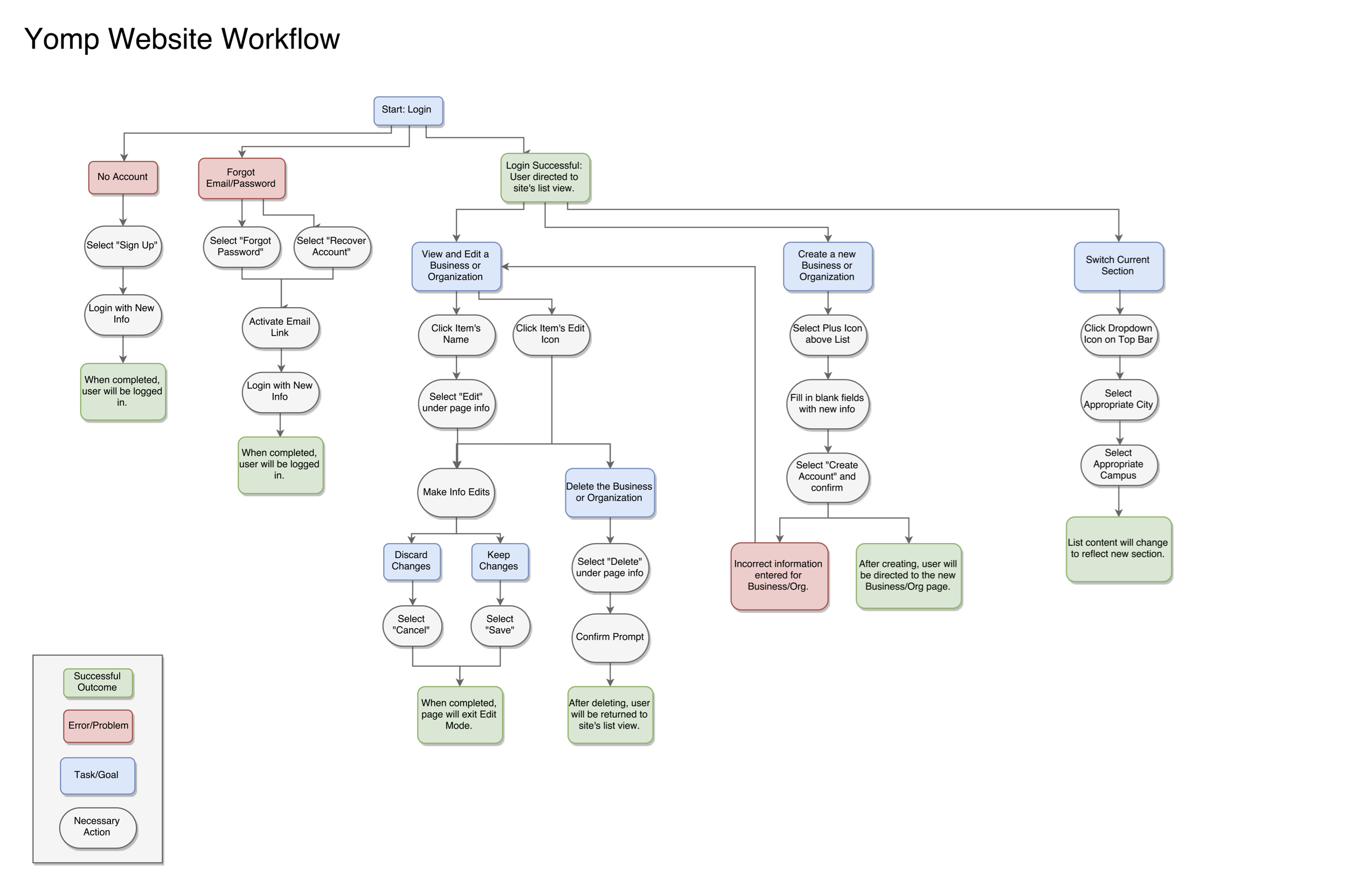
To begin I discussed the goals of the tool with Yomp’s founder and lead developer, forming a list of required elements and interactions. Using these, I built a basic user workflow in draw.io to be used as a guide throughout the design process.
Low Fidelity Wireframes
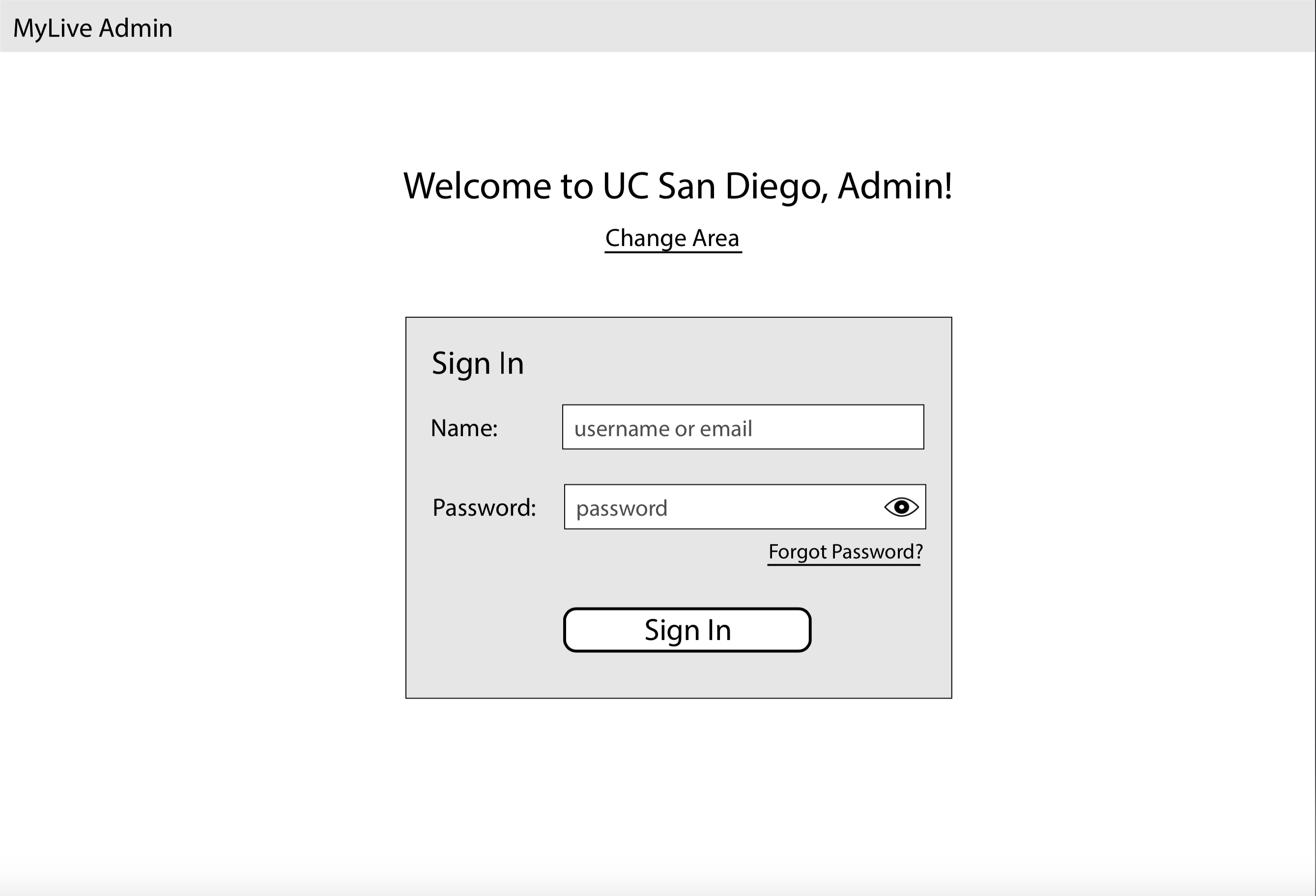
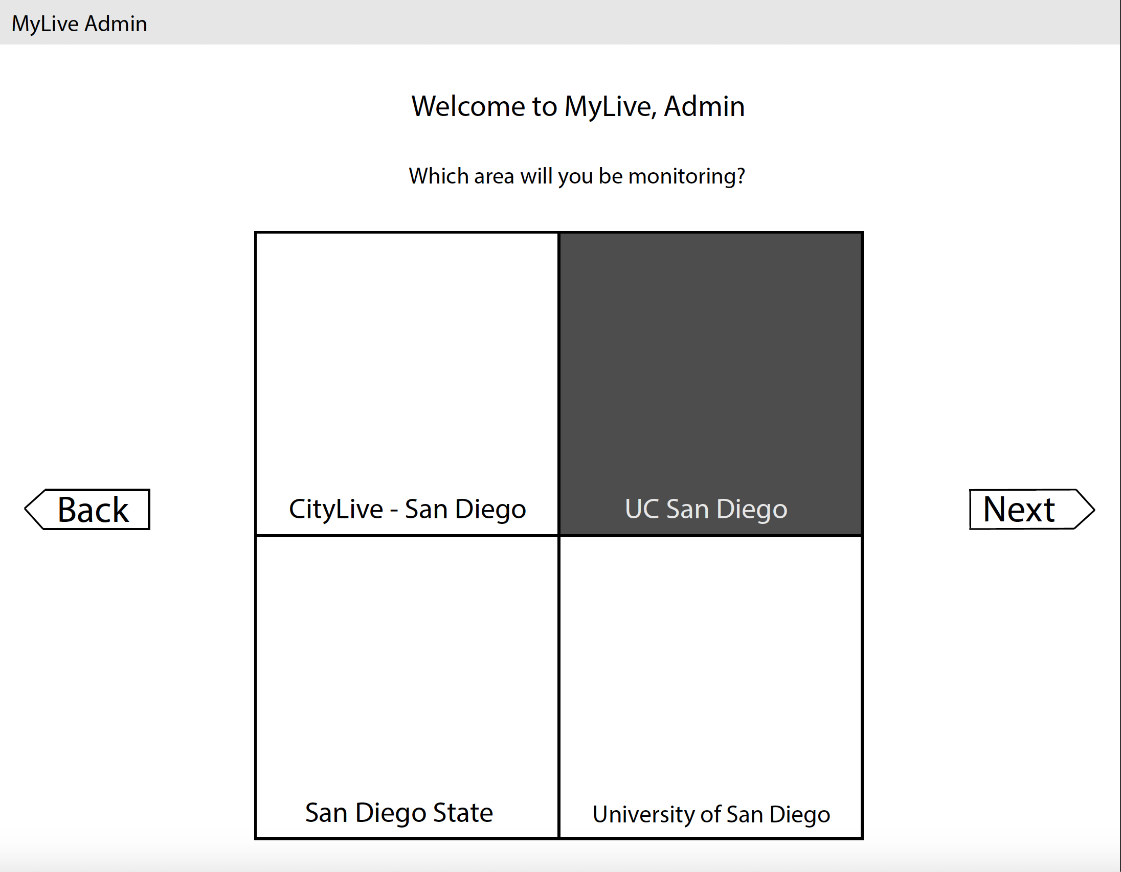
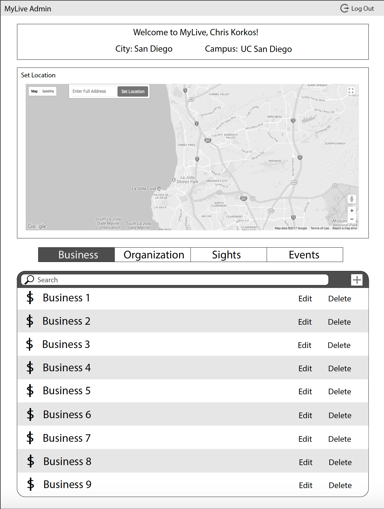
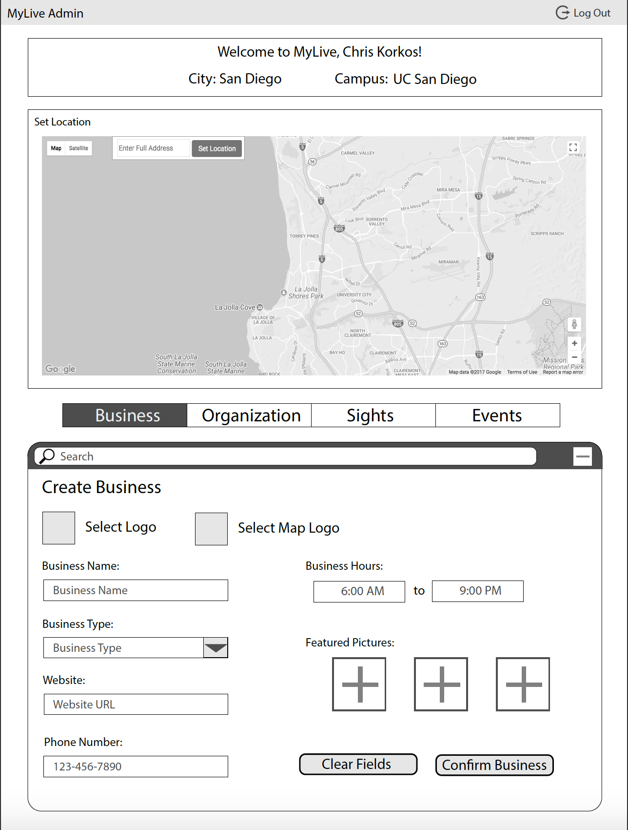
With a workflow established, I put together grayscale mockups using Illustrator. I iterated these to refine the interactions and hierarchy, using feedback from the rest of the team.
User Testing
After ensuring that initial wireframes best fit the UI requirements, I built an interactive prototype using Invision and began focus testing alongside Yomp’s creator.
We ran UCSD students through scenarios in which they played the part of app admins or business managers, attempting to accomplish a variety of tasks. One of us would run the engagement while the other would note any standout comments or user errors that could inform design decisions. Through testing, we discovered major structural changes that improved site navigation.
Mockups
User testing informed design and interaction decisions for higher fidelity iterations, which we iterated internally as a team. During this period of the design process we focused on colors and visual details, specifically with regards to the existing Yomp logo and the target audiences of the app itself.


High Fidelity Interactive Mockups
For final testing and development, I created an interactive prototype in Invision using the high fidelity designs. We used this to conduct final validation of the design decisions before passing the designs to development.
Summary
Challenges
Being a small startup run mainly by students, we didn’t have access to a centralized workspace and as a result much of my work was remote. Using Skype for communication required planning around schedules in different time zones, and weakened typical UX practices like group whiteboarding and user testing. Skype’s screen sharing feature proved useful for presenting and collaboratively working on designs. We also used Google Docs and other collaboration tools for non-design files.
Lessons Learned
Stay comfortable with remote communication technology, and be ready to adapt to circumstances that weaken the utility of in-person tools. When an office or shared workspace is unavailable, keep a workspace at home that accommodates the requirements of the position. This is a basic lesson, but one that has helped me immeasurably during the COVID-19 quarantine. I have been able to stay on top of assignments by maintaining a tidy home workspace, consistently communicating with coworkers, and keeping a personal supply of office necessities.