Sundial
Settings Panel for Mission Manager A.I.
Overview
Roles
UX Designer, Front-End Developer (R Shiny, R Plotly, CSS)
Problem
Artificial Intelligence systems conducting naval operations require users who can mitigate the risk. The system calculates risk from authority, defined as the level of access that the AI has to information and resources, and autonomy, defined as the degree to which the system can make decisions without requiring human participation.
This tool must communicate to users both accurate assessments of risk and methods for best ensuring risk-averse behavior by the AI mission manager.
Key Insights
User Testing should be conducted at every stage of design and development, as it informs decisions across iterations. Additional factors such as available subjects and level of interactivity also influence which issues may be revealed in testing, and therefore should be given as much consideration as possible. Changes are anticipated throughout the process, but keeping testing limitations in mind will increase the chance of catching major issues earlier on.
Note: Due to strict NDA requirements, no products developed under the NDA have been included on this page. The material used in this case study reflects the major decisions in the design process, but replaces UI elements and text. Additionally, the subject matter has been changed to Artificial Intelligence.
Design Process
User Workflow & Requirements
I collaborated with the team lead and system experts to understand the existing algorithm used to calculate risk, including the necessary interactions by users. This helped me to define the functional requirements, determine the placement of the tool in the greater application, and build a user workflow that would inform the design process.
Taking into account the workflow and requirements, the team and I conducted a whiteboarding session to generate UI concepts.
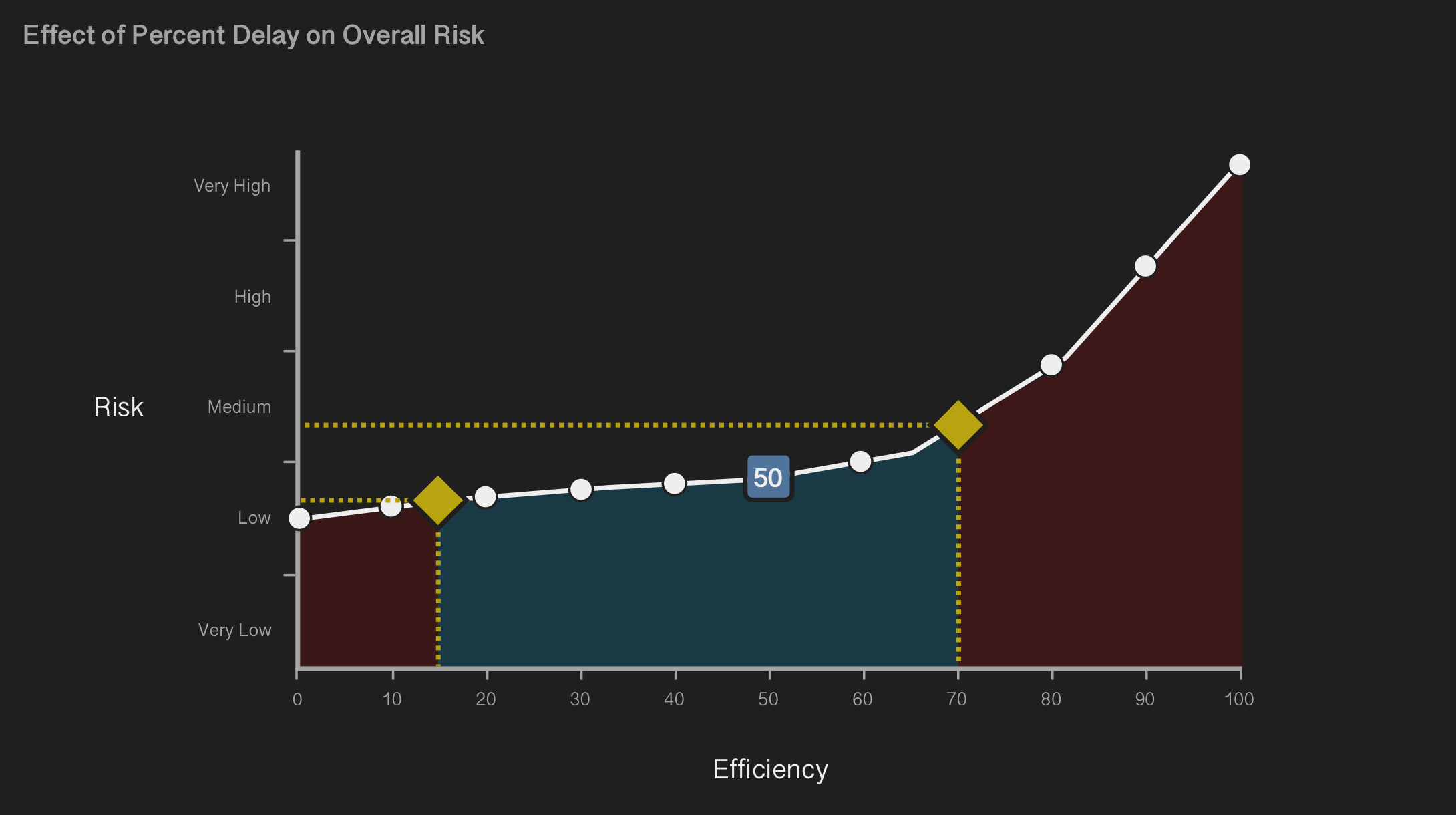
As a method of mitigating risk, we recommended a slider that controlled the AI’s overall efficiency. Lowering efficiency directed the system to operate more slowly overall, which allowed a wider window of time in which human users could intervene to prevent an action. Increasing efficiency also increased risk, but enabled faster execution.
Pen & Paper Prototyping
Using the previously outlined requirements and whiteboarding as a guide, I sketched basic visualizations of the Sundial UI. These sketches first addressed controls over variables used in the algorithm, then the placement and behavior of each UI component.
Testing the concepts with team members enabled us to rapidly evaluate multiple design ideas, in order to determine which best accomplished the workflow's goals.
Mockups
With the major decisions laid out, I created high fidelity designs using Sketch. Visually, the Sundial design needed to be consistent with its parent application - this meant that most UI elements followed pre-determined styling.
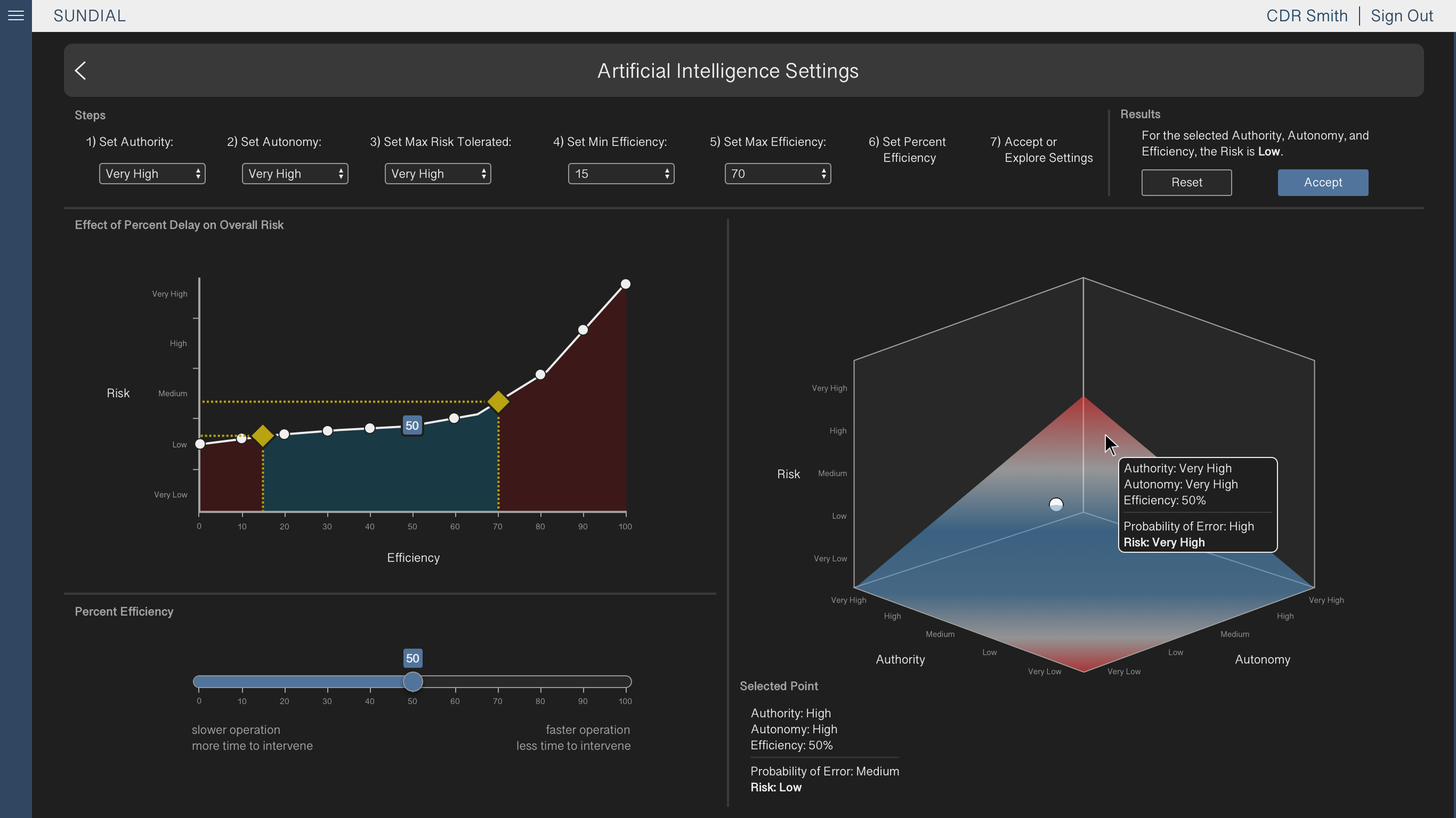
The Sundial mockups displayed a dashboard layout, utilizing multiple data visualizations and controls that manipulate their results in real time. Users had options to Reset or Confirm their selections.
Implementation
Earlier in the process, another team member had built a basic graph tool that used the Sundial algorithm to display data. After finalizing UI decisions, I built them into the existing tool using R’s Shiny and Plotly code libraries.
Additions included dropping a marker on a selected graph point, displaying selected point data below, and coding a tooltip to follow the user’s cursor while exploring the graph surface.
Summary
Challenges
Focus testing revealed that the graph inputs had a clearer purpose when presented as numbered steps rather than more freeform controls. This led to one of the more major design decisions being made late in the process, which increased the amount of time and effort necessary to make the change to the UI. Had we conducted early focus testing outside of the team, the issue may have been addressed before the tool was built.
R was a new coding language for me, though previous experience in web development helped me in understanding the Shiny and Plotly frameworks. I saw this as an opportunity to build on an existing skill and challenge myself as a developer, and while I required occasional help from teammates, I was able to make significant contributions to the final product.
Lessons Learned
When working on an assignment that will require programming, ensure through user testing and adherence to the client's requirements that most major design decisions are made before beginning development. Revisions may be necessary along the way, but significant changes to an already developed UI can cost valuable time.
Pushing myself into unfamiliar territory can be beneficial to both me and the products that I work on. Practicing skills that fall outside of my UX designer role, such as front-end development, can provide me with insight into how outside factors inform design.
Enterprise
Decision Aid for Exploratory Efforts
Overview
Roles
UX Designer, Researcher
Problem
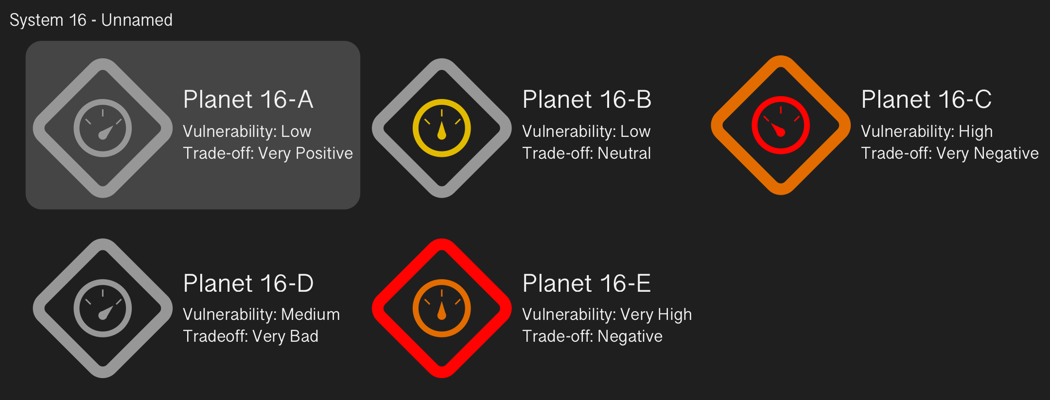
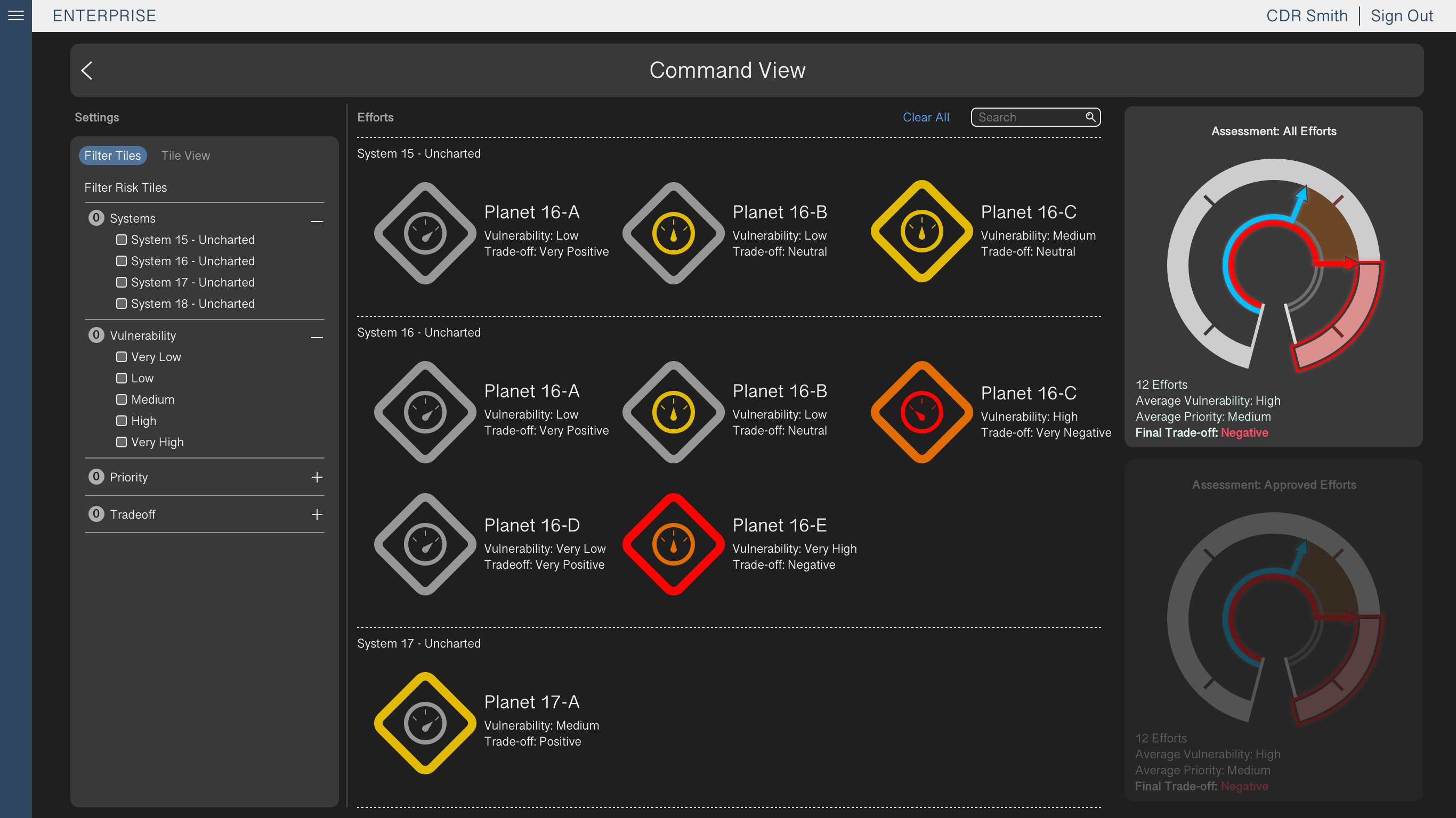
Officials in charge of expansion operations need the ability to quickly track vulnerability, priority, and the resulting impact of planetary colonization efforts. To achieve this, the user interface must convey the affiliations of the existing colonies, communicate the vulnerability and priority levels of each colony effort, and immediately alert users to policies with high vulnerability or negative impact.
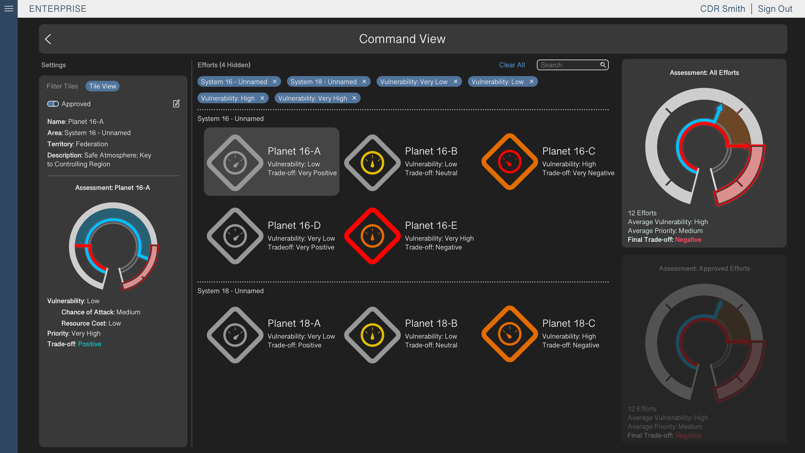
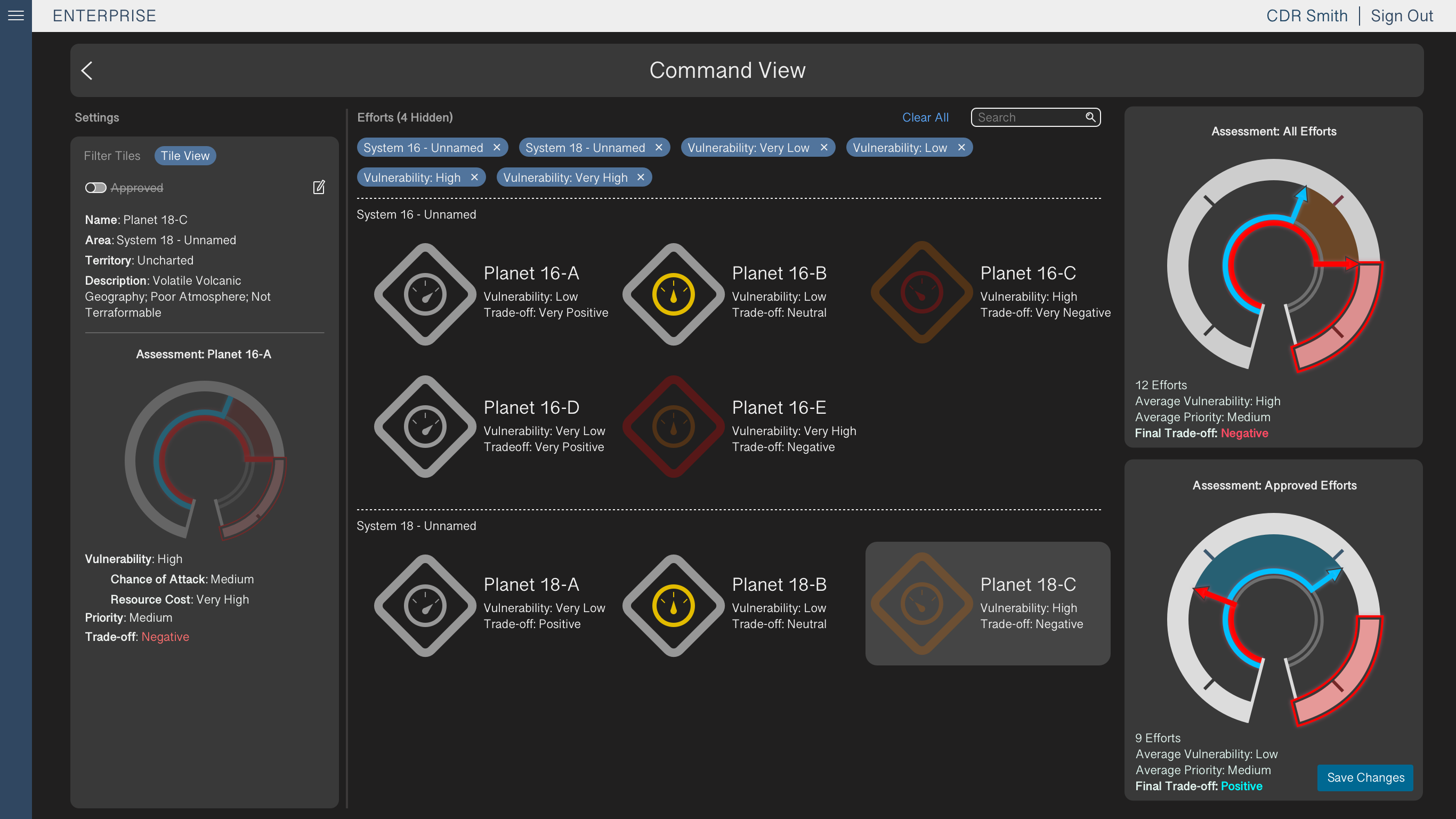
One of the main constraints on the design process for Enterprise was that commanding officials would not be directly using the interface, but rather supervising other personnel who input the officials' decisions. To provide officials a streamlined overview of the system state, our design focus was on the tool’s global “Command View” which provides at-a-glance information on the overall system status.
Key Insights
Color selection is crucial when directing users towards important information. In an interface with a multitude of targets, "emergency" targets should call to users with alert colors such as red and orange. On the other hand, "good" targets should display a neutral color such as gray, rather than the thematically opposite colors blue and green, in order to limit an interface's visual noise.
Accessibility is also important to consider in color selection. The red-green gradient, while relatively common in data visualization, conflicts with Red-Green colorblindness. Red-Green colorblindness affects more than 200 million people globally, and affects the majority of colorblind indiviudals. With usability in mind, it is important to take into account physical limitations that may affect the effectiveness of ingrained design trends.
Note: Due to strict NDA requirements, no products developed under the NDA have been included on this page. The material used in this case study reflects the major decisions in the design process, but replaces UI elements and text. Additionally, the subject matter has been changed to Mission Planning.
Design Process
Whiteboarding
My first task as the designer for Enterprise was to redesign an existing visualization depicting the comparison between vulnerability, priority, and impact in a bar graph format. Feedback on the design had described it as overly complex, with an unclear visual relationship between its three variables.
To brainstorm a new design, the team members held a whiteboarding session in which we discussed visualizations that could more quickly and intuitively describe the relationship between vulnerability and priority.
Pen & Paper Prototyping
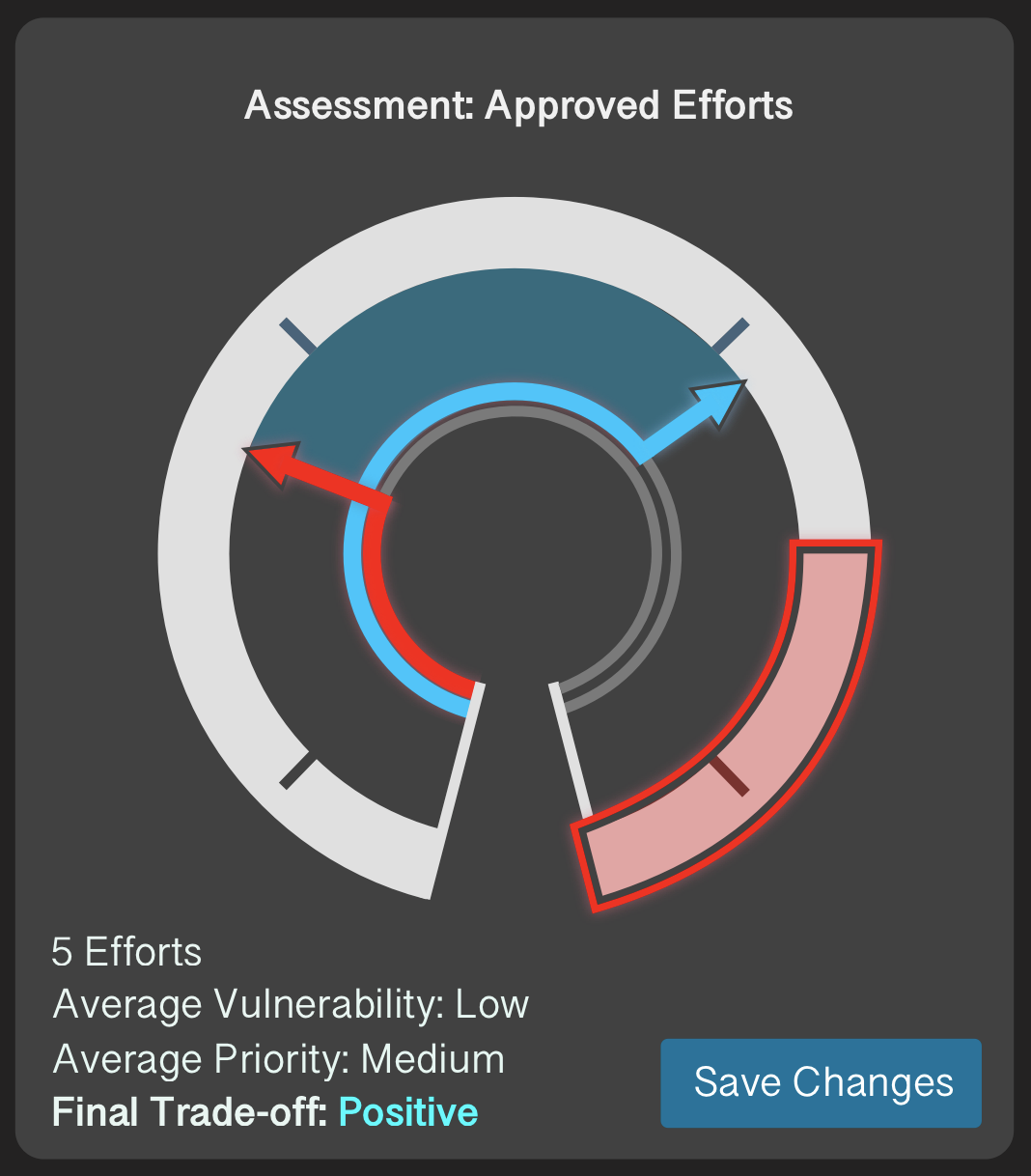
When a concept was established, I sketched several variations on paper. The proposed design combined the variables into a single meter. Vulnerability and priority were displayed as arrows on either side, and the vertical space between them, representing impact, was color coded to whichever was higher. Additional sketches included the Command View, in which all colonies could be navigated, filtered, and individually viewed.
During this phase, I also proposed an alternate color scheme that replaced priority’s green with blue, such that the relatively common condition of red-green colorblindness would not hinder users.
User Testing
While iterating on the pen and paper prototypes, I worked with team members on a user testing script modeled around our use cases. The team conducted focus testing using the script, which informed decisions and helped us to A/B test alternative designs.
This process gave us actionable feedback to be addressed in high fidelity mockups, and ultimately determined the resulting designs to be an effective improvement.
High Fidelity Mockups
After solidifying the design decisions regarding the Meters and Command View, I created high fidelity mockups in Sketch. These mockups enabled us to conduct more thorough testing and validation with users.
One of the more prominent changes that came from the high fidelity testing was changing “good” impact to gray from blue in the Command View. This decision followed feedback that blue drew too much attention from icons with higher vulnerability or worse impact. Upon testing the UI with this change, we found greater success in identifying colonies at risk.

Summary
Challenges
Enterprise was the first assignment I had on its associated team. As a result I had to juggle the tasks of designing a new tool from scratch and learning the parent system’s design standards, which led to me initially pitching the high fidelity mockups with a dark theme. This decision conflicted with system standards, and so it was reversed.
Lessons Learned
Keep details in mind, and always take extra care to learn the system in its entirety before designing new concepts. It’s important to be motivated to work, but moving too fast may necessitate backtracking.
Marathon
Approval System for Mission Planning
Overview
Roles
UX Designer
Problem
Officials involved in mission planning require a tool for approving missions with multiple categories of varying parameters. This enables officials to set the general guidelines for mission planners laying the groundwork for an operation.
Approved Missions can be specified based on various hierarchical factors including Region, Mission Type, Mission Priority, and Clearance.
Key Insights
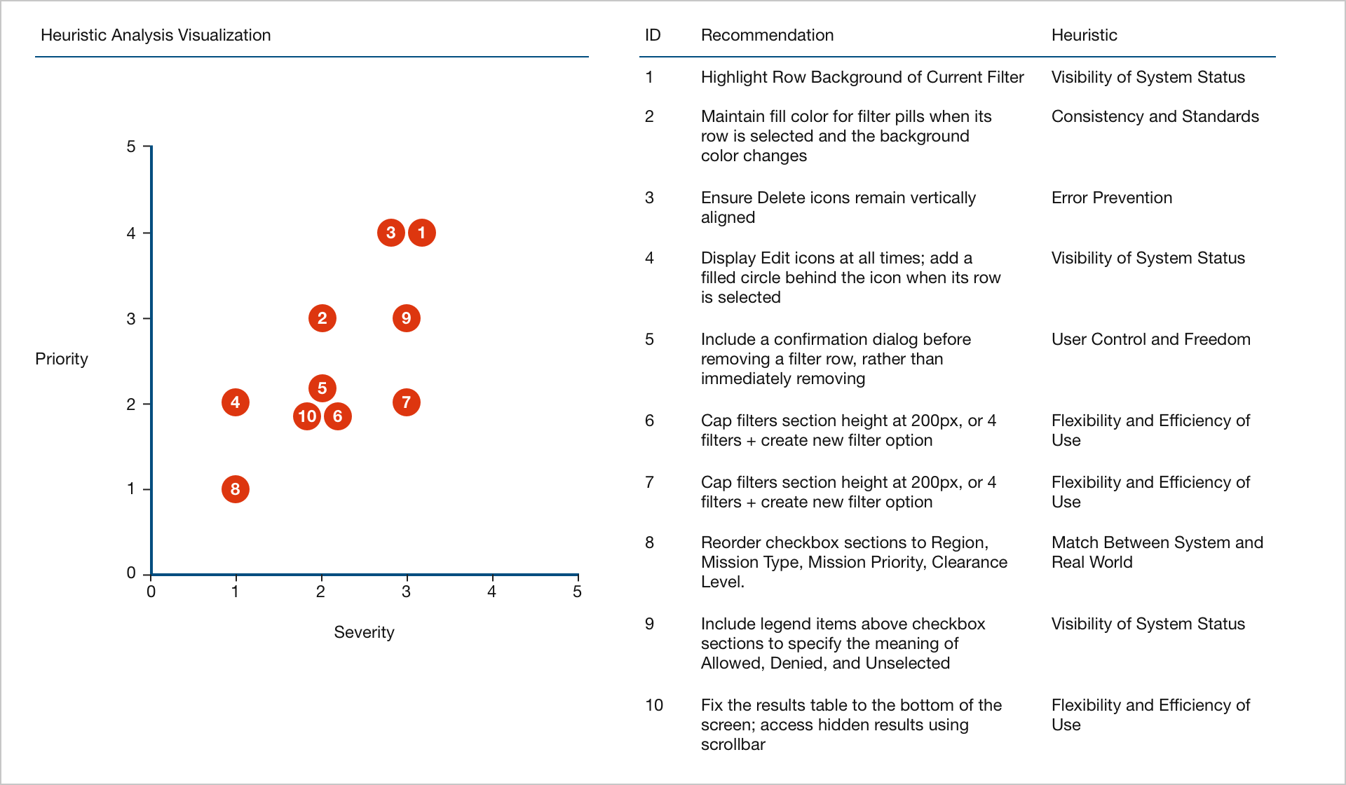
Team members may not immediately recognize the utility of design decisions. Heuristic analysis can quantify the priority and severity of each recommendation, assign standardized usability issues, and visualize the overall impact of addressing the observed issues. Employing heuristic analysis while designing the Marathon UI enabled me to strengthen my recommendations and ensure best practices were followed.
Note: Due to strict NDA requirements, no products developed under the NDA have been included on this page. The material used in this case study reflects the major decisions in the design process, but replaces UI elements and text. Additionally, the subject matter has been changed to Mission Planning.
Design Process
User Workflow & Requirements
The UI existed before my involvement on the team, so before beginning redesigns I worked with other members of the team to map out the existing user workflow. Understanding the workflow informed what would change based on design changes throughout the project.
To build the workflow, I first used post-it notes during discussion and afterwards translated them to a basic workflow in PowerPoint.
Low Fidelity Wireframes
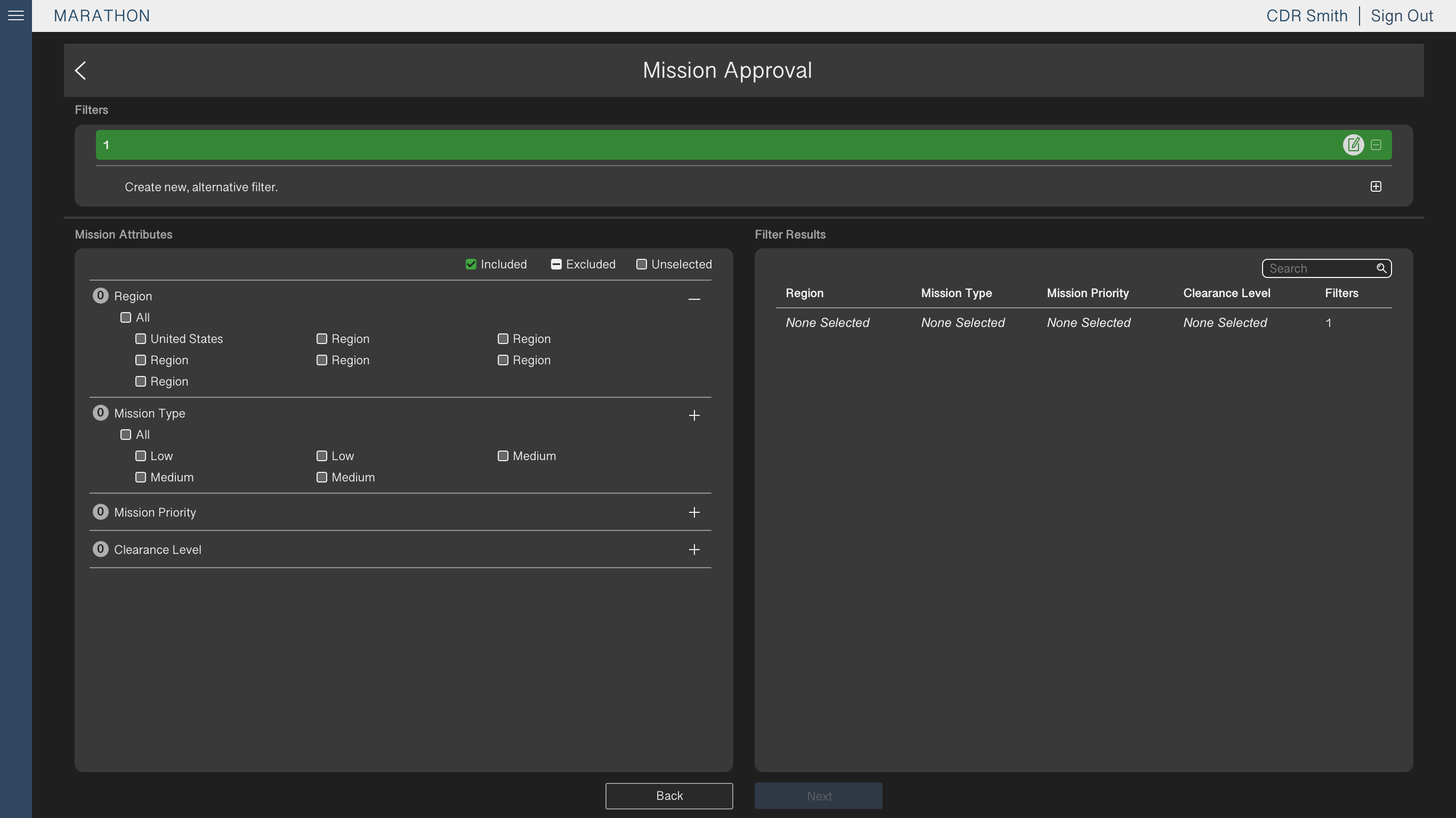
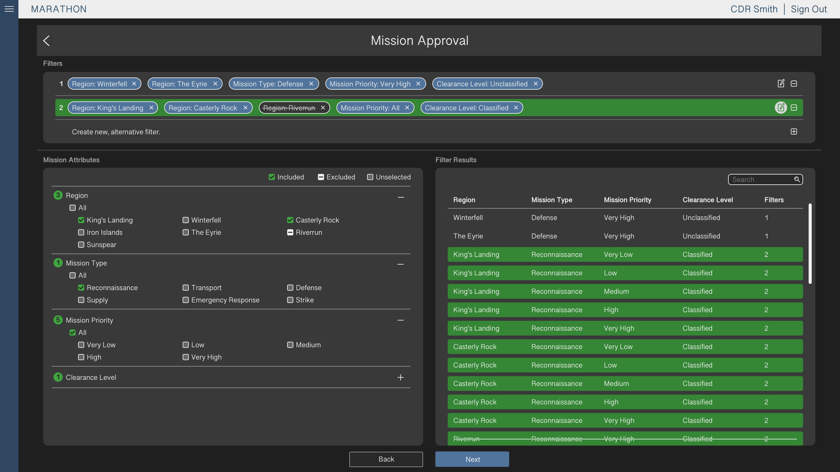
After finalizing the workflow and determining requirements, I sketched my proposed design. The main change was a table displaying the Location-Type-Priority-Clearance tag combinations, as these results of the user’s selections were not made explicit in the original UI.
We also restructured the checkbox selections from dropdown menus to accordion sections that could be expanded or collapsed by the user. This enabled the user to view items from multiple categories at once and reduced the number of clicks to select an item.
Mockups
After iterating on the broad design ideas to determine the overall UI structure, I built high fidelity mockups in Sketch and incorporated the visual design consistent with the existing application.
The team lead and I coordinated with developers to prioritize design decisions, making changes based on ease of implementation and system restrictions. After several iterations on the original high fidelity mockups, the developers began applying our recommendations.
Implementation and Heuristic Analysis
One of the challenges we faced during the design process was communicating with the developers, who were working remotely. Conference calls became an additional communication barrier, and as a result many design decisions were misinterpreted or ignored.
As a solution to the difficulties in communication, I conducted a heuristic evaluation of the UI. I used Nielsen’s usability heuristics for interaction design as backing for previous unaddressed recommendations, as well as a guide for holistically evaluating the UI. I also followed Nielsen’s severity ratings for usability issues, to emphasize recommendations with a larger impact on the system.
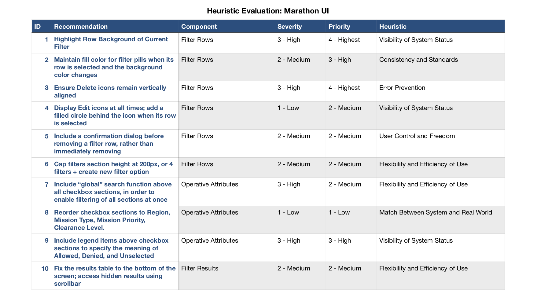

Using the heuristic evaluation as a reference improved our communication with the developers, more efficiently prioritized the requested changes, and pushed through key changes that improved usability across the interface.
Summary
Challenges
As the number of Locations and Types increases, and as new categories are added to the parameters, the user interface must be able to scale with the changes.
Lessons Learned
Capabilities like searching and filtering enable the user to reduce the amount of on-screen noise, in order to more easily find their preferred options. Table flexibility (i.e., resizing rows and removing empty columns) and horizontal scrolling can lessen the impact of the additional content.
